

Brand identity & packaging system · Zar Macaron

Pasta Artisan — Complete Brand System
Self-directed University Project |
Market Gap Identification & Brand Strategy
02 — Positioning
Made in the spirit of
traditional Italian methods
Artisan-inspired pasta is pasta made the traditional Italian way — good wheat, bronze dies, slow drying. The bronze leaves a rough, chalky surface, and that surface is what holds a sauce.
Bronze-die extrusion, slow drying, careful wheat selection and traditional packaging carry the whole sense of authenticity and quality, without the ceiling of a fully handmade process. The category delivers a rougher texture, more stable shapes and a flavour close to workshop pasta — at a workable price, with wider distribution and real production capacity. The result is dependable industrial quality wearing the identity of classic Italian pasta-making.
That sentence became my brief. The product is industrial; the story is artisan. Everything I designed had to be the honest bridge between the two — never a costume.
03 — Illustration system
One drawing per cut.
Three colours from one flag.
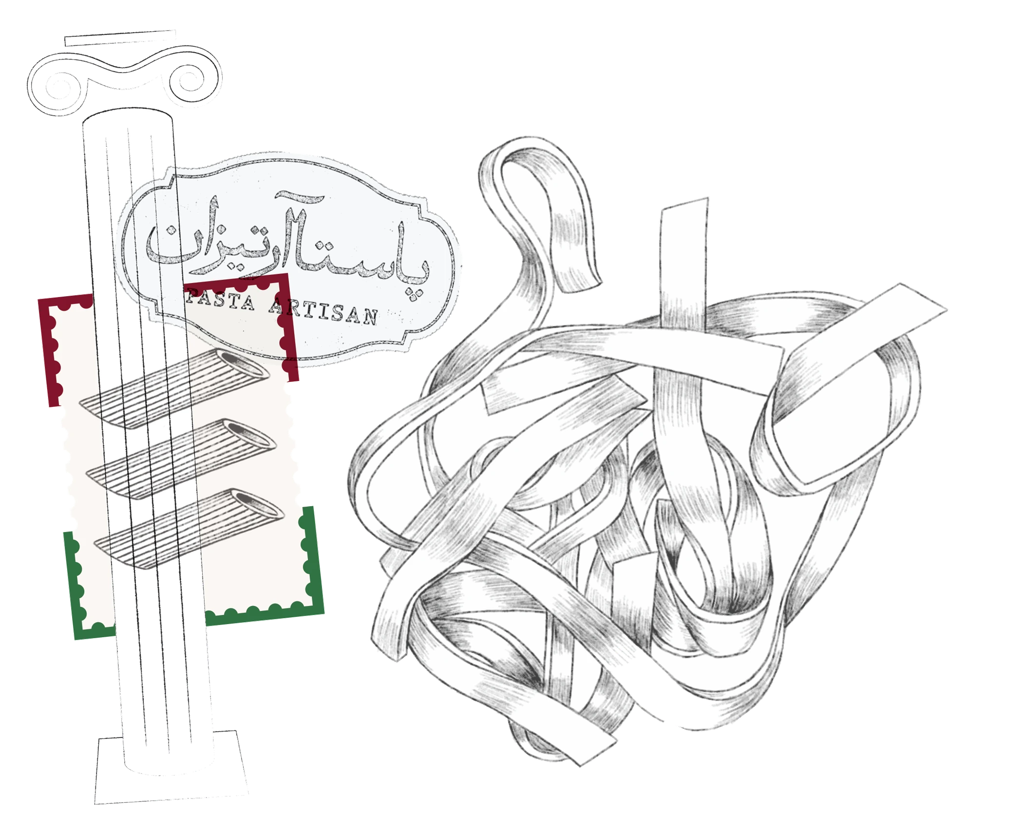
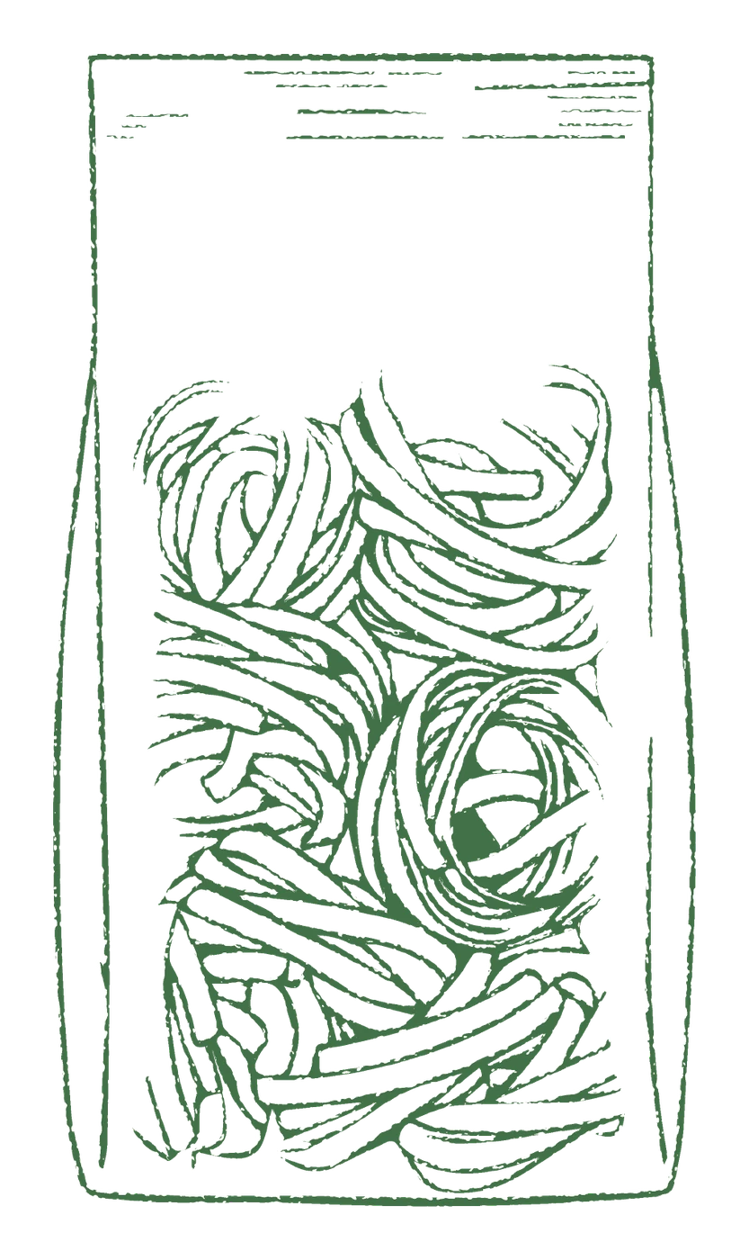
I drew each cut by hand and coded it green, charcoal and red inspired by the Italian flag. On a crowded shelf the drawing is the fastest thing to read: a shopper identifies the cut before a single word of Persian or English, and the ink weight signals "made by someone" long before the copy has a chance to say it.



04 — Packaging strategy
Sustainable and authentic packaging
The glass-jar strategy
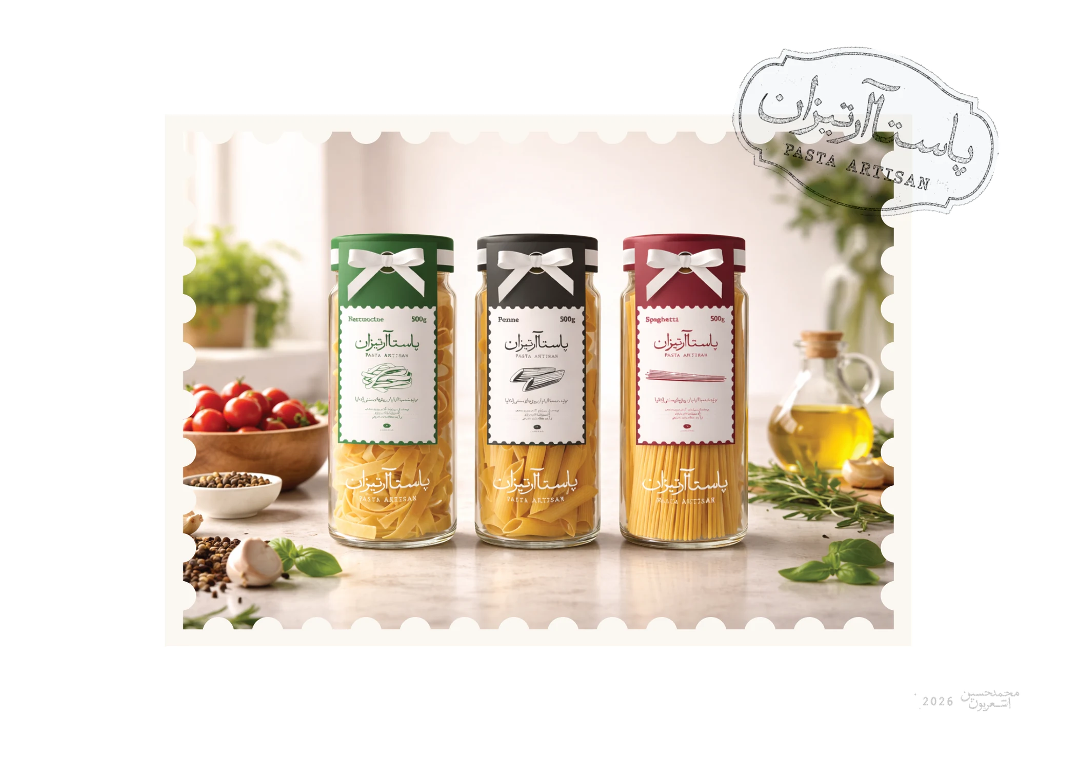
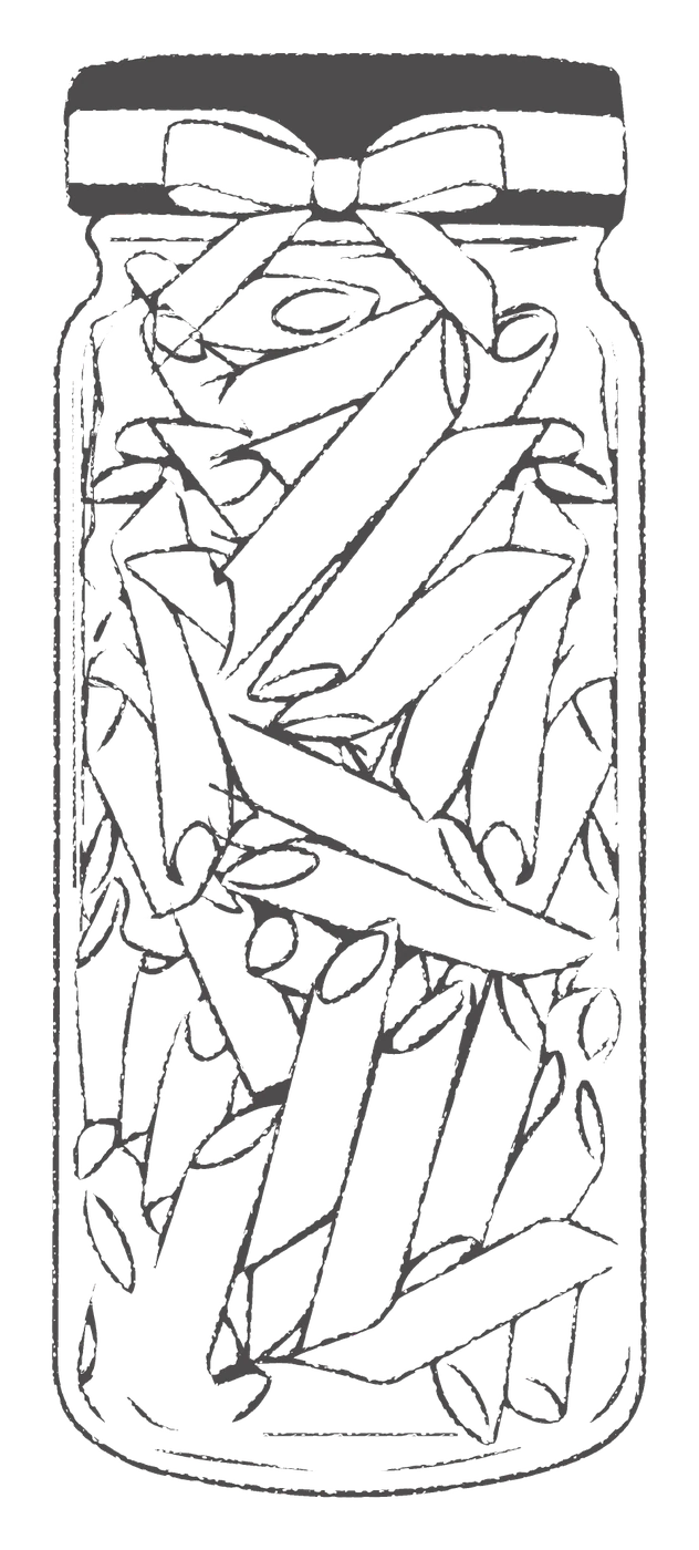
Glass is the sharpest tool available for separating Pasta Artisan from everything beside it. Where competitors sell in the same busy, interchangeable plastic bags, a jar says "authenticity and tradition" without a word. The transparency lets a customer read the rough bronze-die texture, the pale colour and the quality of the raw grain before paying — the nostalgia of something made carefully, set directly against mass factory output.
Past the visual, the jar is a medium in its own right: living, lasting advertising. Unlike disposable packaging, glass has value and does not get thrown away — it stays on the kitchen shelf as a storage jar. That long physical presence puts the brand in front of a family every day, recharging loyalty at no further cost and fixing the brand inside their daily life.
This is the argument that justified the whole price position, so I designed the jar first and let the label, the drawings and the refill range follow from it.

05 — The label system
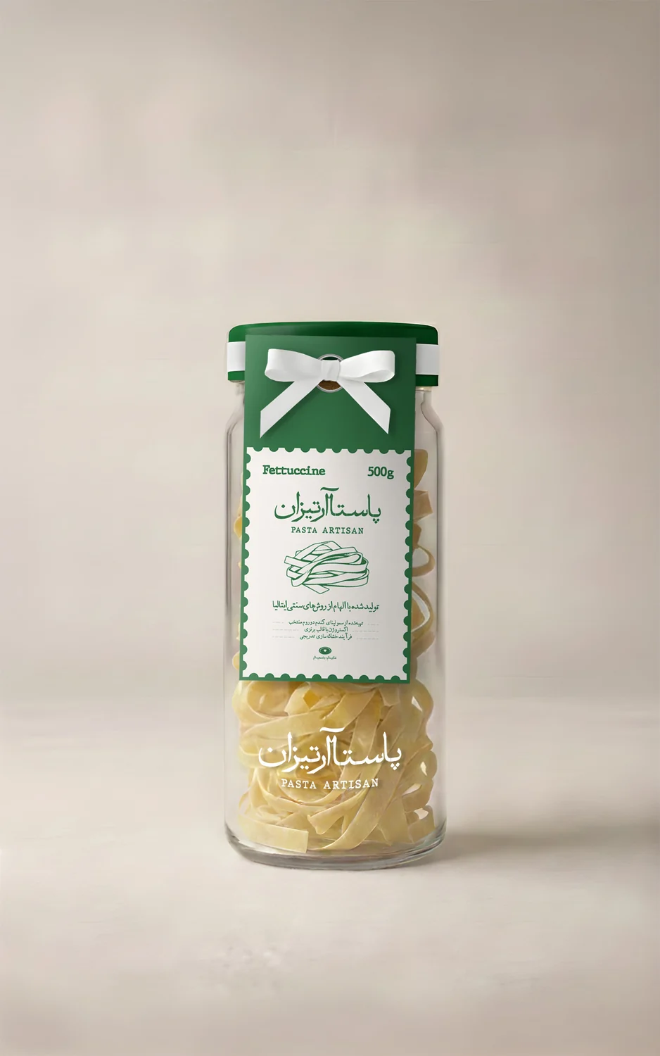
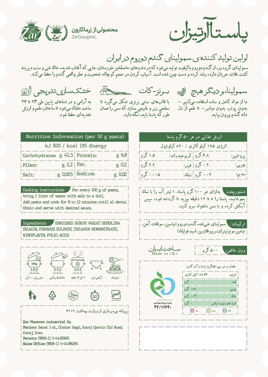
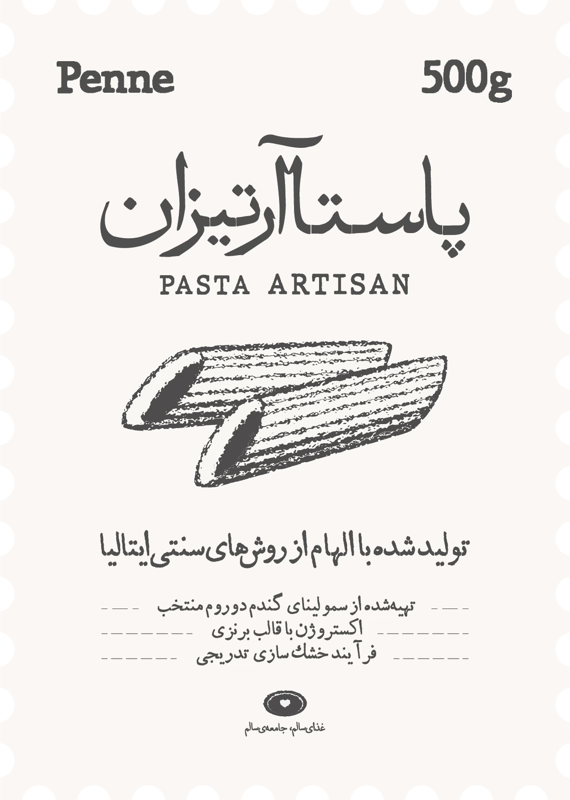
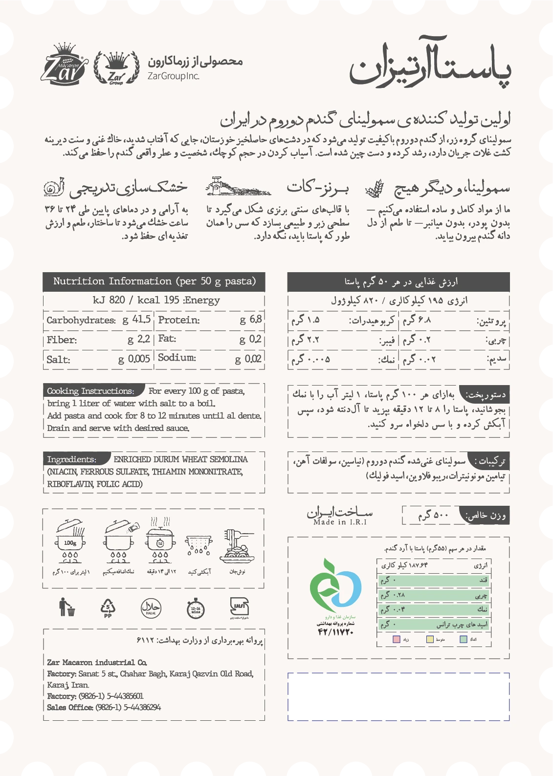
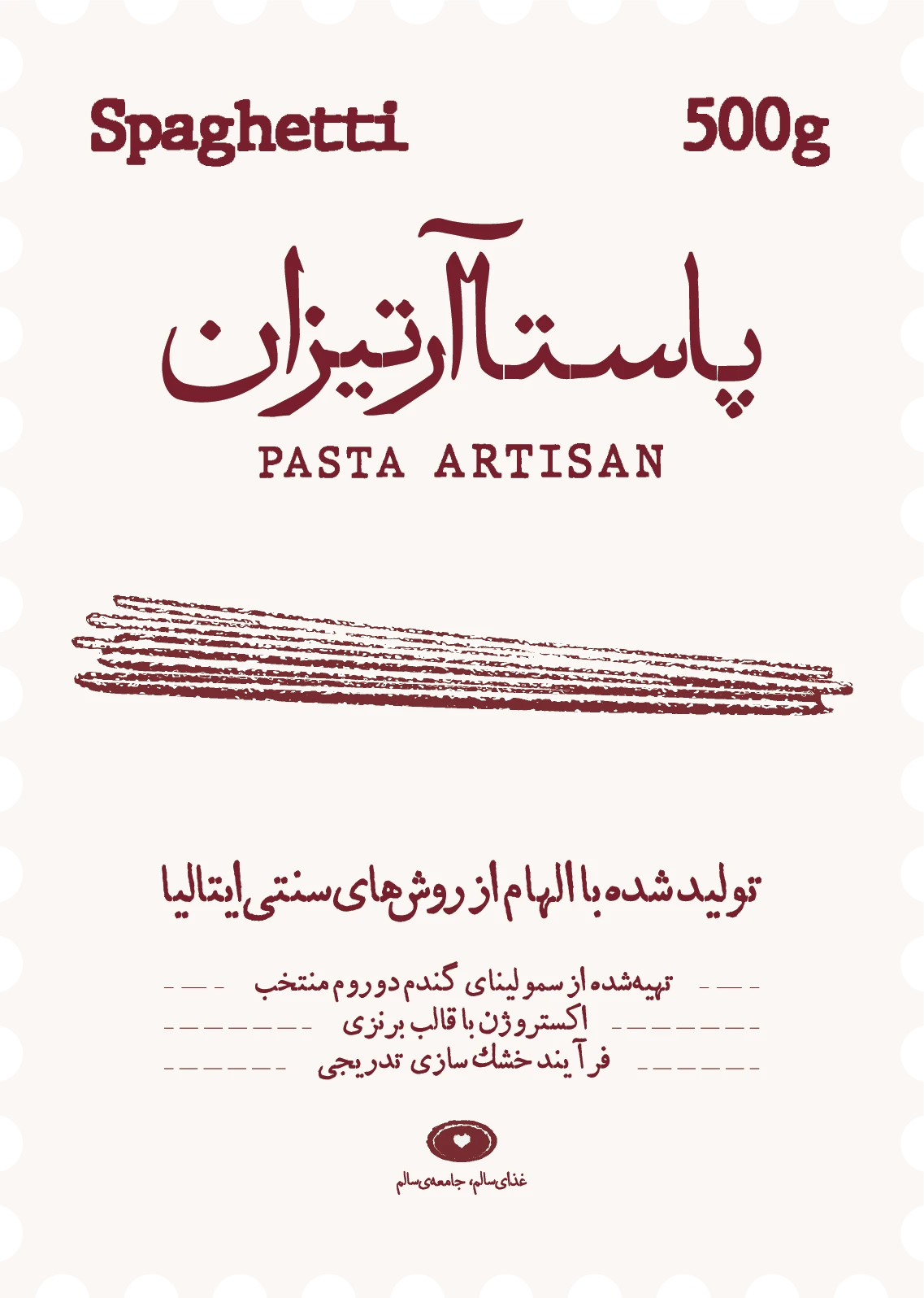
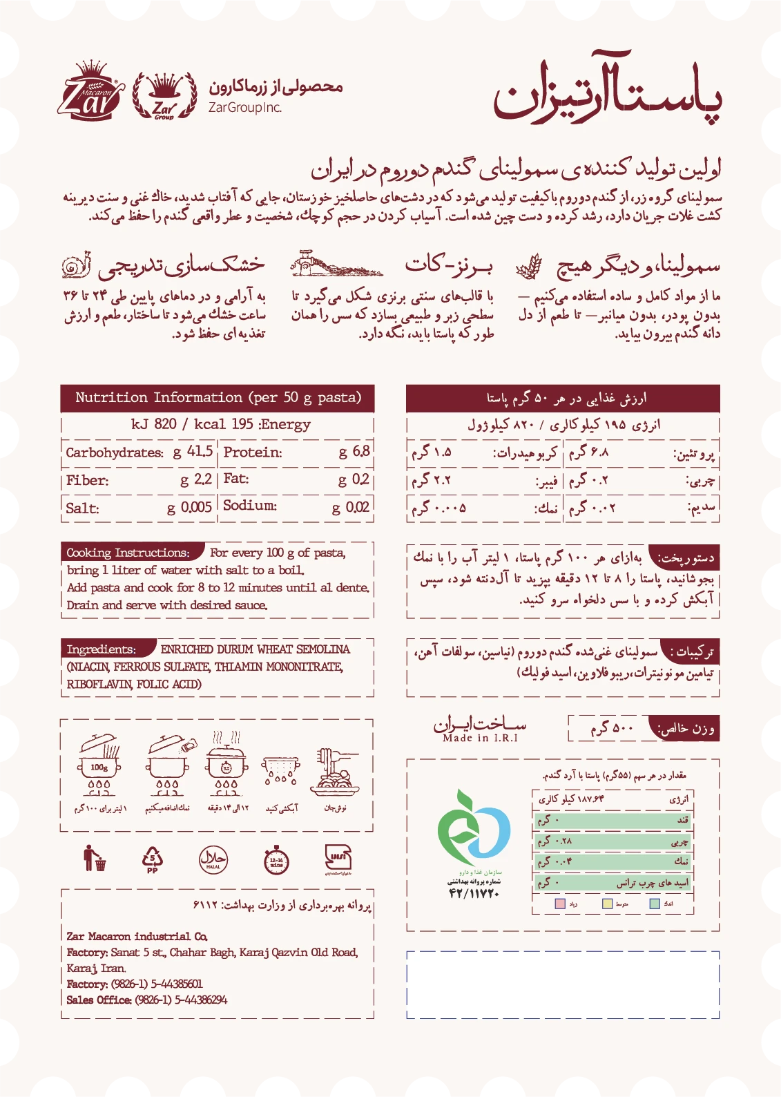
Every variant runs the same stamp-cut die: the bilingual lockup and the hand-drawn cut on the front, the full Persian / English spec sheet on the back. Only the colour and the drawing change. Click a label to open it and read it up close.
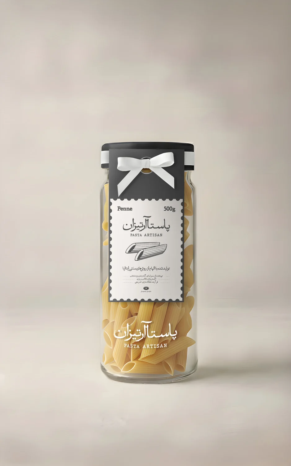

05 — The label system
Every variant runs the same stamp-cut die: the bilingual lockup and the hand-drawn cut on the front, the full Persian / English spec sheet on the back. Only the colour and the drawing change. Click a label to open it and read it up close.
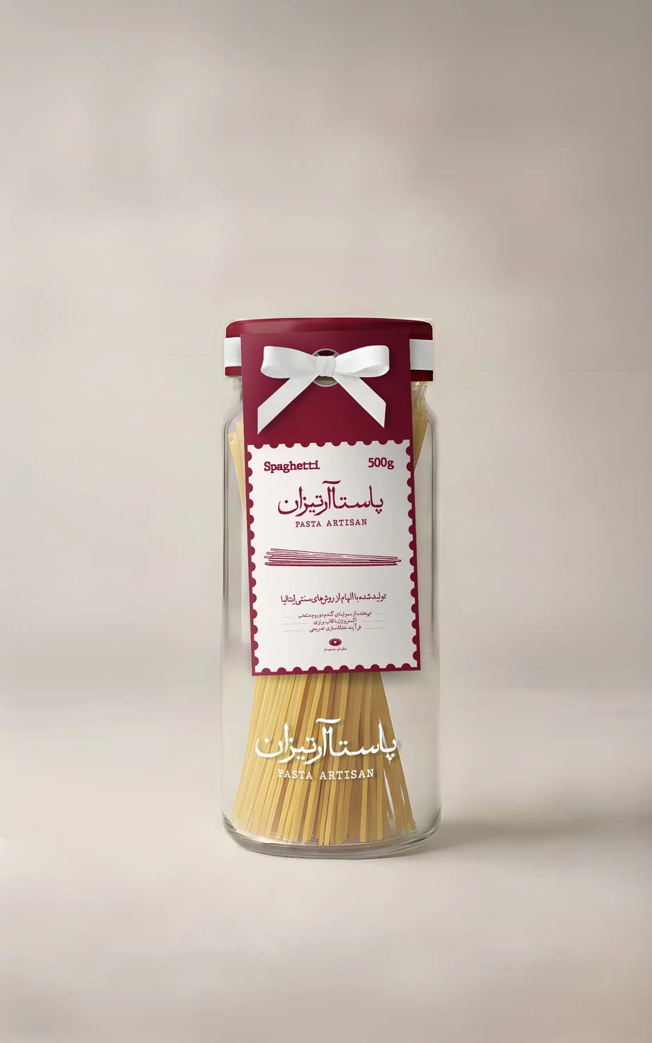

05 — The label system
Every variant runs the same stamp-cut die: the bilingual lockup and the hand-drawn cut on the front, the full Persian / English spec sheet on the back. Only the colour and the drawing change. Click a label to open it and read it up close.
06 — One system, three cuts
Change the colour and the drawing.
Nothing else moves.
Holding the die, the lockup, the grid and the back panel constant is what makes three products read as one brand from two metres away — and it is what keeps a fourth cut cheap to add later.

07 — Sustainability
The re-fill strategy
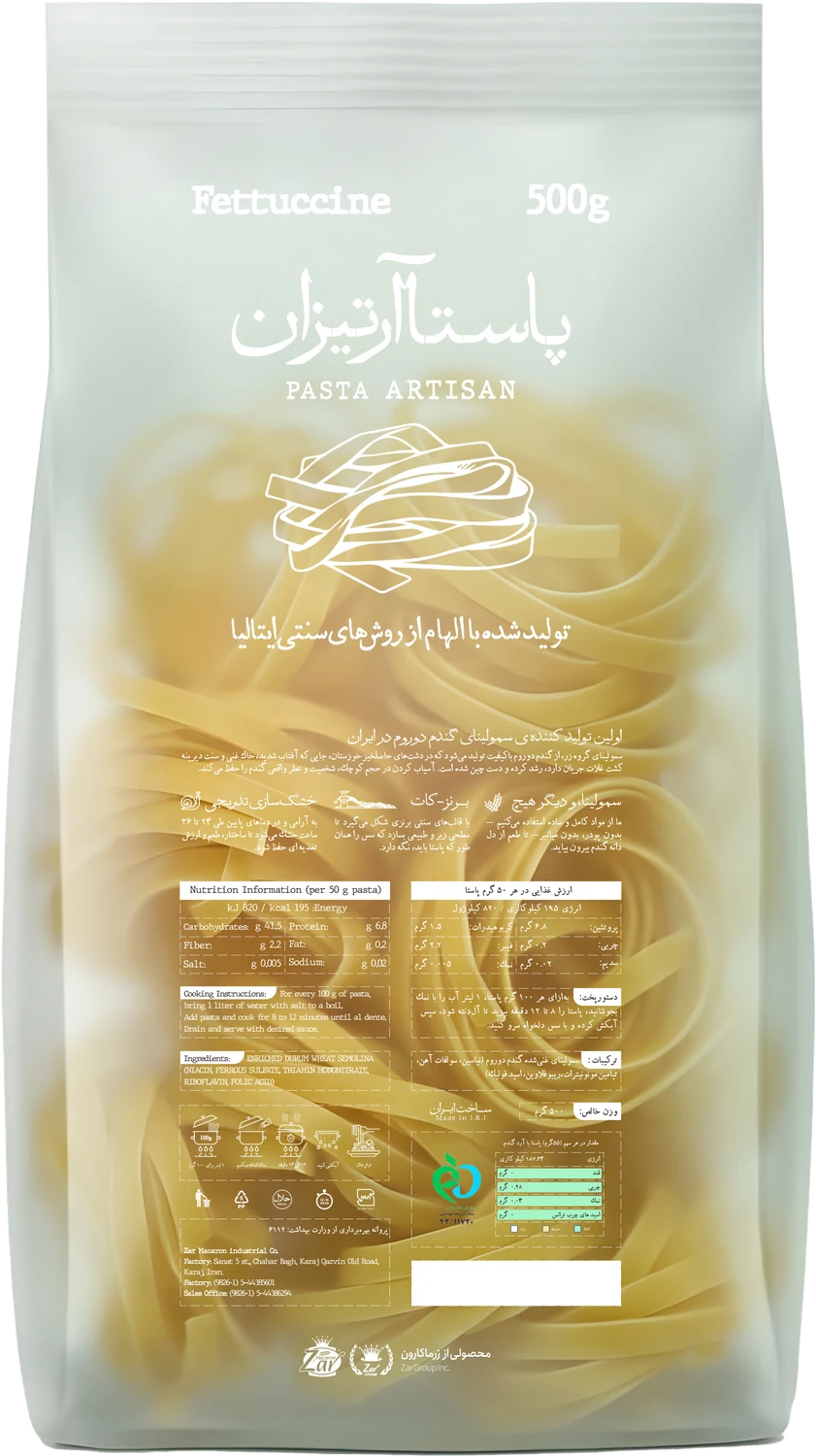
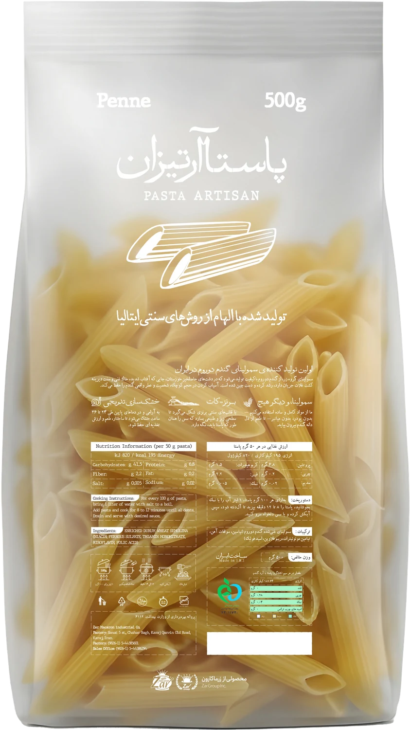
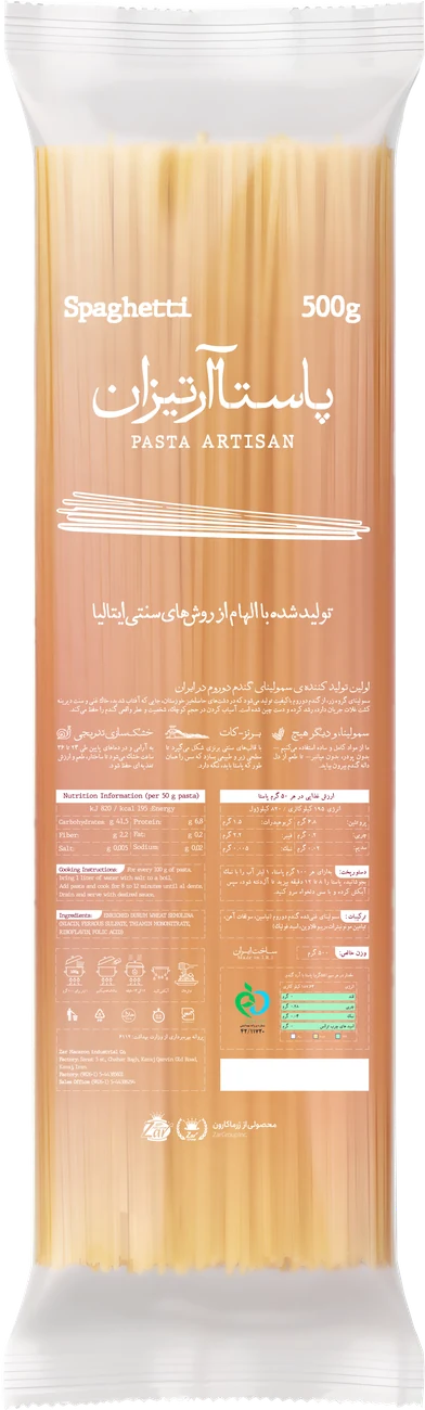
To close the loop — and to make the environmental claim real rather than decorative — the jar is sold once and refilled after that. Every later purchase is a pouch.
The pouches are matte, fully biodegradable film, designed with the least printing and the least ink the information will allow. That pairing — a jar that lasts plus a refill that breaks down — puts Pasta Artisan in front of the market as the traditional pasta that is genuinely environmentally minded, and creates an offer no competitor on that shelf can match.
Designing the pouch to be plainer than the jar was deliberate. The jar is the object you keep; the refill only has to be honest, cheap to print and easy to recognise.
08 — The refill range
Matte, fully biodegradable film. The same lockup, the same drawing, the same 500 g — printed with as little ink as the information allows.